Data vis with d3 + react: Service monitoring app
A quick discussion/show off of a small project I have been working on to get some more data visualisation work under my belt.
This is because data vis is the main focus of my work on my side project, ![]() Poseidon, a surf forecasting web app, and because I just love working on data vis.
Poseidon, a surf forecasting web app, and because I just love working on data vis.
Uptime is an interactive dashboard for visualising service/website performance, specifically in terms of response time and response status code.
The project is on the MERN stack - Mongo, Express, React and Node. NoSQL/Non-relational DB, although this is completely optional. The data is relatively organised and would also suit a traditional SQL/Relational database.
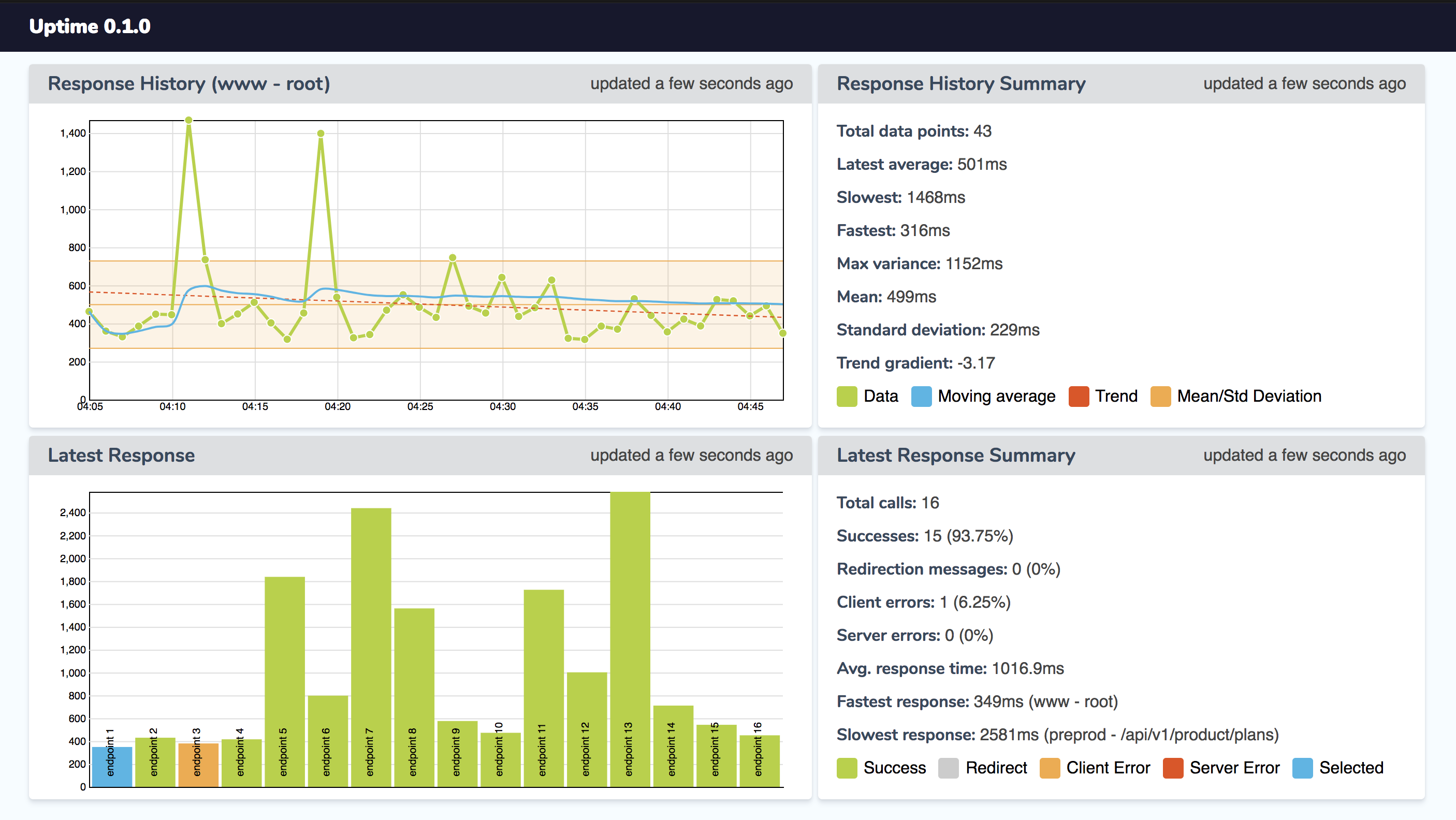 Screenshot with anonymised data.
Client layer
Uses d3.js heavily in order to organise and visualise the timeseries data after fetching it via our express app API from the DB. React facilitates the interactivity between non-d3 and d3 elements, enabling things like simple toggling on/off of data layers via clicking the relevant key/legend item.
Server/API layer
An Express app running on node starts up, schedules a regular task for fetching and storing the various services data in the database layer, and also provides a restful API layer for the client layer to interact with so that we can draw our data out of the DB and actually visualise it.
Database layer
A simple Mongo DB setup, using a timeseries style schema. Each regular interval that the express app scheduled task runs at will be stored as a new document, in a timestamped chronological series.